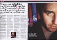
- Main image- Should take up lots of room. Usually on the left or bleeding to the other side
- Main heading- Stands out against the background and rest of the text
- Colour schemes- Colour scheme must be simple and should not clash, they must have around 3 or 4 colours. It must match the main image.
- Headlines/Dylines- These should be bold, unique, short & snappy
- Page numbers- In the bottom left corner, accompanied by website address. Page numbers must also be stated on the images, linking the image to the correct story
- Website address- Accompanies page numbers
- Font- Size 11 pt. Double page spreads must contain lots of text
- Quotes- Main quote in bold and larger font to entice readers
- Columns- Around 3/4 main columns to keep it professional and tidy
- Informal language- Informality of the text allows readers to connect to
- Stand first- Will be above or below the title and in a different font
- Drop quotes- Drop quotes will be in a larger font in order to stand out
- Credits- Credits are usually at the bottom of the page and are for the author and/or photographer
- Drop capitals- Larger and bold capital at the beginning of the article
- Artists name- Should always be highlighted and large in order to stand out
- Masthead


No comments:
Post a Comment