Sunday 17 October 2010

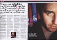
Analysis of Music Magazine Double Page Spreads

  • Main image- Should take up lots of room. Usually on the left or bleeding to the other side
  • Main heading- Stands out against the background and rest of the text
  • Colour schemes- Colour scheme must be simple and should not clash, they must have around 3 or 4 colours. It must match the main image.
  • Headlines/Dylines- These should be bold, unique, short & snappy
  • Page numbers- In the bottom left corner, accompanied by website address. Page numbers must also be stated on the images, linking the image to the correct story
  • Website address- Accompanies page numbers
  • Font- Size 11 pt. Double page spreads must contain lots of text
  • Quotes- Main quote in bold and larger font to entice readers
  • Columns- Around 3/4 main columns to keep it professional and tidy
  •  Informal language- Informality of the text allows readers to connect to  
  • Stand first- Will be above or below the title and in a different font  
  • Drop quotes- Drop quotes will be in a larger font in order to stand out
  • Credits- Credits are usually at the bottom of the page and are for the author and/or photographer  
  • Drop capitals- Larger and bold capital at the beginning of the article  
  • Artists name- Should always be highlighted and large in order to stand out
  • Masthead


Saturday 16 October 2010

Analysis of Professional Music Magazine Contents Pages

For this task, I had to analyse a professional music magazine contents page. I used a site called 'Prezi' to show my analysis.


Analysis of Music Magazine Front Covers

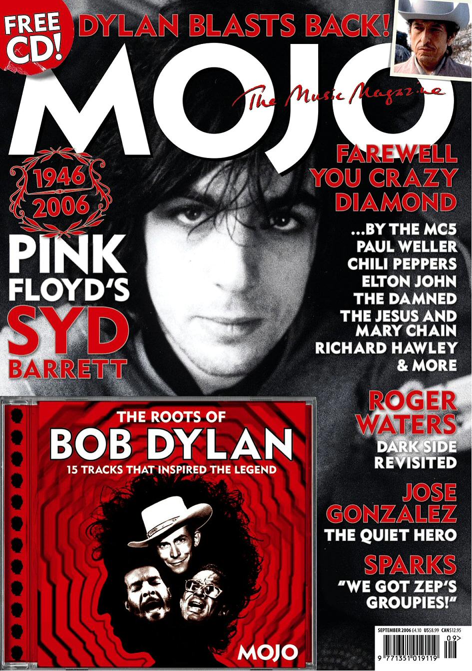
For this task I had to take three different music magazine front covers, and analyse them:

1.

2.


3.

Wednesday 13 October 2010

Initial Plans for my Magazine

In this lesson, I was asked to come up with my initial plans for my music magazine. These plans consisted of: price, frequency of publication, average issue size, regular content, and feature articles.
  • Price- £2.99
  • Frequency- Monthly
  • Average issue size- 80/90
  • Regular content- Upcoming gigs, interviews, win, posters
  • Feature articles- Interviews with different artists

Monday 11 October 2010

Researching the Market Place

For task 2, I had to conduct research into existing music magazines that fit the target audience I have selected for my music magazine. I selected Kerrang, NME, Q and . I had to find and compare their: title, price, frequency, size of issue, positioning statement website and publishers website.


Title- NME
Price- £2.20
Frequency- Weekly
Size of issue-
Positioning statement- '
New Musical Experience'
Regular content-
Feature articles-
Magazine website- http://www.nme.com/
Magazines publishers website- http://www.ipcmedia.com/


Title- Q
Price- £3.90
Frequency- Monthly
Size of issue-
Positioning statement- '
Britain's Biggest Music Magazine'
Regular content- Subscriptions, 10 Commandments, Crossword,
Feature articles-
Magazine website- http://www.qthemusic.co.uk/
Magazines publishers website- http://www.bauermedia.co.uk/


Title- Kerrang!
Price- £2.20
Frequency- Monthly
Size of issue- Around 60
Positioning statement- 'Life is Loud'
Regular content- Feedback, News, Win!, Live Reviws, Albumn Reviews, Gig Guide
Feature articles- Cover story
Magazine website- http://www.kerrang.com/
Magazines publishers website- http://www.bauermedia.co.uk/


Title- MoJo
Price- £4.40
Frequency- Monthly
Size of issue-
Positioning statement-
'The Music Magazine'
Regular content- Hello Goodbye, Real Gone, Ask Fred, Theories Rants Etc, All Back To My Place
Feature articles-
Magazine website- http://www.mojo4music.com/
Magazines publishers website- http://www.baeurmedia.co.uk/

Sunday 10 October 2010

Initial Ideas

The initial ideas I have come up with for my main task of designing the front cover and contents page of a music magazine are:
Genre- Pop rock
Target audience- 14-23 year olds, mixed gender

Evaluation of School Magazine

In what ways does your media product use, develop or challenge forms and conventions of real media products?
Throughout the planning and constructing of my magazine front cover and contents page: I strictly followed the codes and conventions I had previously found. This meant using a medium close up for my main image, different font for the title, a font size of 11 pt for any subheadings and throughout my contents page, leaving as little white space as possible, ensuring there was a bar code, price, website and date on show and so on.

How did you use new media technologies in the construction of your media product?
For the construction of my magazine front cover, I used Adobe Photoshop. This piece of software was new to me, but was easy to adjust to. This made it easy to design my cover quickly. This software allowed me to edit the images I was using so that they looked more professional and were the right size and I also created a title for my front cover. Due to some difficulties I faced with Photoshop and the editing of photos, I had to change my main image. This meant I also had to change my main story line from 'Cakes Save Lives' to 'Best GCSE's on Wirral'. Luckily this did not set me back in time.
         However, for the production of my contents page I used Quark. This was totally new to me as I had never heard of it; but like Photoshop it was easy to use. I created a document, with three columns

What are the strengths and weaknesses in the construction of your media product?
I feel that the front cover I have produced looks professional and follows the codes and conventions. I like the background and the way the text stands out against the background. Moreover, I feel that the image I have used looks more professional than the original image I edited. The way the image I used fits against the background ensures a professional look.
        One of the biggest problems I faced was the amount of space there was on my contents page. When I was planning my contents, I did not consider the size my font would be and also the layout. As I used Quark the contents page is set out in three columns. This meant that I had to move all my objects around to ensure that it all fit, but also use as much space as I could. This meant that I had to increase the size of the font. This do not follow the codes and conventions of a magazine contents page. Moreover, the main image on my finished design of my front cover does not match my plan. This was down to the way the image looked against the background. I felt that the image did not look professional enough. Although I changed the main image and main story line, I was still able to get all work done on time.

Saturday 9 October 2010

Production of School Magazine Contents Page

To create my school magazine contents page I used a piece of software called Quark. This is what my final product looks like. However, due to deadlines I was unable to complete all of the contents to match the plan.

Production of School Magazine Front Cover

To create my school magazine front cover, I used Photoshop. This is what my final product  looks like.

Friday 1 October 2010

Images for Front Cover and Contents

These are the images I took for my magazine front cover and my contents page, I then edited these using Adobe Photoshop.


This is my main image for the front cover. This image shows a GCSE student with his GCSE results, this covers the story of top GCSE grades on the Wirral.


This image is for my contents page, this is the Elephant Ears team and covers the story of their return.


This was originally going to be my main image, however it did not look professional ernough after being editted. Instead I used it on my contents page to cover the story of the money raised for Rainbow Trust.


This image was taken for my contents page. This image links to the story of the Beauty and the Beast cast being revealed.